
I found this map on Get StumbledUpon. The Centers for Disease Control and Prevention wanted Americans to know the unusual causes of death that took place in each city. There was no special or private message accompanying this map, just some eye-popping information. Sorry for being such a downer.
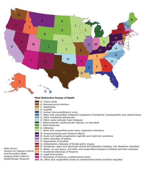
The CDC recently released this infographic to show off the “most distinctive causes of death” in each of the 50 states. It’s also available on the CDC website. This is a result of data from 2000 to 2010.
The CDC doesn’t mean that you are going to die of the same causes. The Center just wanted to share statistics.
.
