
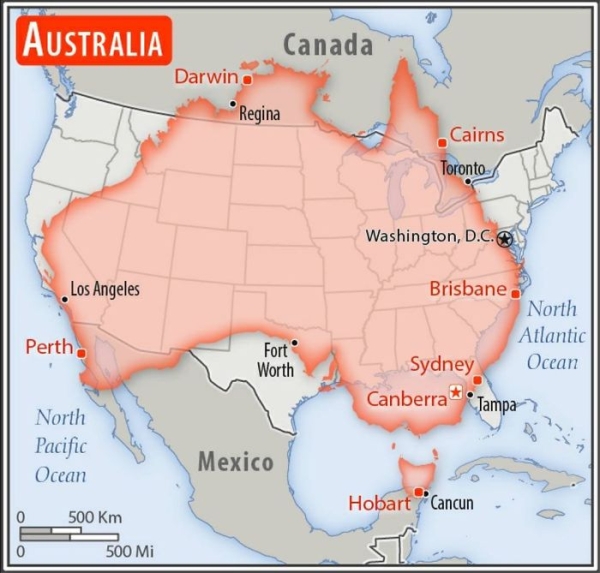
Size Comparison Between Australia And the United States
———————————————
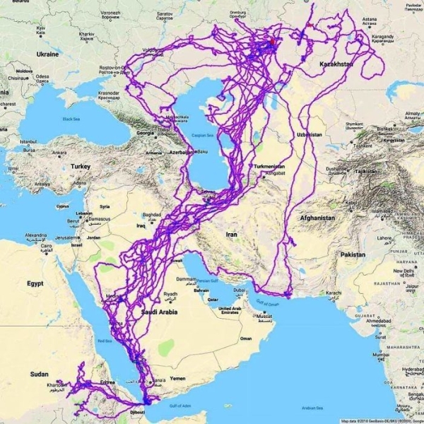
Tracking Of An Eagle Over A 20 Year Period
———————————————
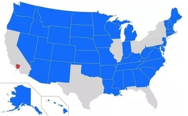
Blue States Have A Smaller Population Than Los Angeles County
———————————————
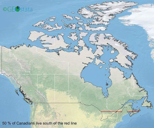
50 Percent Of Canadians Live South Of The Red Line
———————————————

The Biggest Non-Government Employer in Each State
———————————————
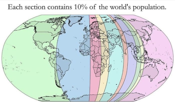
Each Section Has 10% Of the World’s Population
———————————————
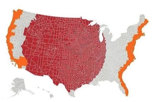
The Red and Orange Sections Have Equal Populations
———————————————
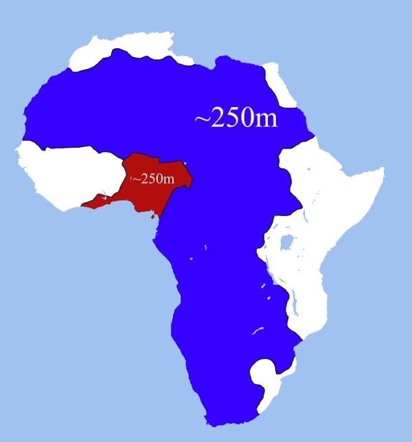
These Two Areas of Africa Have Roughly Equal Populations
———————————————

love the maps – interesting read – thank you
Interesting! And surprising.